:: Double Daggers
GOTTA LOVE THE GLYPHS, NO. 1
A Beautifully Designed Anicillary Character Gives Me Pause
Yes, it’s true, the name of my business, Ampers&® Studio, is centered around, and includes, an ampersand (&) character. Not so surprising. I am, after all, a typographer. And what typographer doesn’t love ampersands? I’ve written about them here.
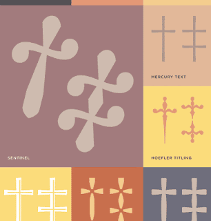
But in this instance, the letterform giving me pause is that third-order reference mark used in punctuation, a.k.a. the double dagger (‡), pictured here in a graphic I came across on Typography.com. (And isn’t it lovely?) The graphic accompanies an article about Reference Marks:
“Daggers come from that archipelago of typographic symbols known as reference marks, which refer readers elsewhere for explanatory or exegetic notes. The traditional first-order reference mark is the asterisk (*)….”
And that, my friends, makes fascinating reading for typography fanatics such as myself (seriously). If you love type, too, you might enjoy reading more from H&FJ News’ article, House of Flying Reference Marks, or Quillon & Choil, here.*
A Dire Dagger Dillema
This glyph, in particular, happened to catch my eye because of a situation in a recent project I’d been working on. You see, an asterisk had already been used within the project’s text, as had the dagger (the second-order reference mark). So when my client requested to add in a third reference set, I used a double dagger, which is standard operating procedure in typography.
Well, as it happens, the dagger had been used to indicate those deceased individuals mentioned within the text (which, if you think about it, is kind of ironic…). Anyway, to use the double dagger as a reference for a distinguished position held, even though proper, somehow didn’t seem right. Further, it was difficult to tell who had been honored and who had passed on! (This would not do at all.) So instead, I threw the rules of typography right out the window (gasp!), and went with a lovely lozenge or diamond (◊), which seems like a much more distinguished mark to use for signifying a distinguished position. So forgive me, my mentors — who taught me the differences between, and proper usage of, EM- EN- and regular ol’ dashes — I know the situation called for a double dagger, but “sometimes you just gotta do whatcha gotta do, eh?”
*Check out the asterisked bit at the end of H&FJ’s article, an advisory notice from the New Oxford English Dictionary on pronunciation. (Don’t you just love it? :)
* * * * * * * *
ED. NOTE: This entry was first posted on Blogger, under the handle “ampersandblogger,” in June 2009. : : kf, 1/4/19