Notice: Function _load_textdomain_just_in_time was called incorrectly. Translation loading for the visual-portfolio domain was triggered too early. This is usually an indicator for some code in the plugin or theme running too early. Translations should be loaded at the init action or later. Please see Debugging in WordPress for more information. (This message was added in version 6.7.0.) in /mnt/ceph/home5/a/m/ampersandstudio.com/public/blog/wp-includes/functions.php on line 6170
Notice: Function _load_textdomain_just_in_time was called incorrectly. Translation loading for the wpfront-scroll-top domain was triggered too early. This is usually an indicator for some code in the plugin or theme running too early. Translations should be loaded at the init action or later. Please see Debugging in WordPress for more information. (This message was added in version 6.7.0.) in /mnt/ceph/home5/a/m/ampersandstudio.com/public/blog/wp-includes/functions.php on line 6170
Notice: Function _load_textdomain_just_in_time was called incorrectly. Translation loading for the twentytwelve domain was triggered too early. This is usually an indicator for some code in the plugin or theme running too early. Translations should be loaded at the init action or later. Please see Debugging in WordPress for more information. (This message was added in version 6.7.0.) in /mnt/ceph/home5/a/m/ampersandstudio.com/public/blog/wp-includes/functions.php on line 6170 PASSIONS (BLOG) - ampers& studio Deprecated: Function WP_Dependencies->add_data() was called with an argument that is deprecated since version 6.9.0! IE conditional comments are ignored by all supported browsers. in /mnt/ceph/home5/a/m/ampersandstudio.com/public/blog/wp-includes/functions.php on line 6170
original, creative communication design solutions for print, web and more—since 1986
:: kinetic typography
GO WITH THE FLOW
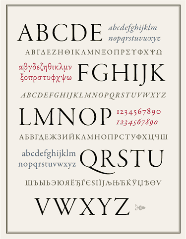
Artistic tributes to typography come in all shapes and sizes, fonts and formats. This one, a well-executed animation by Garry Moore, has got the flow, along with some wisdom on Staying Open and the value of being aware of all that surrounds us as we travel our individual trajectories. Enjoy this short (00:51) featuring an insightful message from Glen Hansard.
TYPOGRAPHY AT ITS BEST — BE STILL, MY HEART ♥
:: I love type
Okay, I’ll admit it. For some reason, higher math has always escaped me. Which is why I often found myself practicing letter forms & doodles in the margins of my notebook back in high school. (My math skills may have suffered, but my handwriting was beautiful! ;) I was in love with type. I devoured books on typography, font samples, type nomenclature, and the evolution of the written (and printed) word. As early as the ninth grade, even my art teacher recognized my love of graphic forms & color and steered me towards the graphic arts program at our school. “Why don’t you give it a try?” she asked. “I think you’ll like it.” And so I did. (Thanks Mrs. Lindsay!)
The Graphic Arts instructor, Mr. Markowitz, also noticed my love for graphics and type. He encouraged me to take on extra projects over the next few years, and ultimately suggested that I pursue a career in the Graphic Arts. The rest, as they say, is history….
Oh-so-many years later, it still holds true. I’m still awed by coming across a beautifully executed typeface; mystified by the secrets of ancient petroglyphs; intrigued by the friezes on Mayan ruins and the hieroglyphs of the Great Pyramids; and dazzled by the calligraphy of an ancient scribe. All over the world and throughout time—from prehistoric cave drawings made in the earliest days of man to the eye-popping webfonts of the 21st century—forms of written communication continue to evolve and intrigue us. And it’s all out there just waiting to be discovered, shared, appreciated, understood.
Yep, I love type. It’s a lifelong passion for sure, and I strive to make that evident in my work. ♥
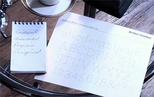
:: what’s your type?
YOUR TRUE CHARACTER, REVEALED
When I came upon this fun, holiday quiz, What Type Are You?, from the folks at Pentagram Design, I couldn’t resist giving it a try. I was curious to see just how accurate they’d be in matching my personality to a particular type face. After a series of four simple questions, they analyzed my answers, and pegged me as an “Archer Hairline” type of gal. The font is quiet, simple but elegant, with surprising details revealed when scrutinized more closely. I have to say, that does suit me.
Give it a try here [link removed] and find out your true type!
The above image is a screen-grab of my type “diagnosis,” courtesy of Pentagram (thanks, Pentagram!)
* * * * * * * * ED. NOTE: This entry was first posted on Blogger, under the handle “ampersandblogger,” in January 2010. : : kf/&, 1/12/10
:: Helvetica
ACCEPT NO SUBSTITUTES
It’s no secret; I love type. There’s something about letterforms that I find absolutely mesmerizing. As a I child, I would spend hours pouring over type specimen books, drinking in their subtleties of form. And my favorite was always Helvetica.
Later on, when I was off at college studying typography, I learned that Helvetica was the favorite of a lot of other folks, too. In fact, its use is “universal.” (Pardon the pun, typophiles. :)
Think you DON’T know Helvetica? Check out this PBS short video: Helvetica [link removed]. It’s actually a clip from a movie about the type face. (See? I told you there were a lot of other Helvetica enthusiasts out there!)
Think you DO know Helvetica? Try this fun game, where designer David Friedman found 20 logos originally designed with Helvetica and swapped them out with Arial. (Blasphemy!) Your job is to pick out the original. Have fun! (I got a perfect score! How about you? :)
* * * * * * * * ED. NOTE: This entry was first posted on Blogger, under the handle “ampersandblogger,” in January 2010. : : kf/&, 8/10/21
::Snow Angels
ONCE UPON A TIME, A VERY LONG TIME AGO…
a flash of red, a shiny sled goes by
two brothers tumble off with runny noses and snow-covered hats, laughing
they jump to their feet and race back up the hill to take another run (what fun!)
another streak of red, a flash of blue
(so cute, with rosy cheeks) then shrieks — of delight — impromptu snowball fight! (and that’s my cue … )
i sneak inside the house, it won’t be long
before they tramp inside with frozen toes and shed their clothes:
four soggy mittens, and two pairs of boots, and snow pants, and jackets, and hats, and scarves,
in one great puddle on the kitchen floor
i greet them at the door
with two big hugs and two hot mugs of cocoa to warm their cores
momma, ben put snow down my back, says russ, with a chocolaty pout; from ben, a devilish grin — big brothers always win …
their happy chatter fills the room with warmth, my heart with joy; each one is such a special boy
with ruddy faces and tousled hair they melt my heart, they light my soul
i wonder if they know,
my angels in the snow
The typographic cloud graphic above (my “snow cloud,” if you will) was created with a wonderful (but addictive) program called Wordle. The poem, by yours truly, harkens back to a snowy day—a very long time ago…. [ find more of my poems ]
* * * * * * * * ED. NOTE: This entry was first posted on Blogger, under the handle “ampersandblogger,” in December 2009. : : kf/&, 12/21/18
:: My kind of humor
TYPE TEE (HEE! :)
“Haikus are easy
But sometimes they don’t make sense
Refrigerator”
* * * * * * * *
ED. NOTE: This entry was first posted on Blogger, under the handle “ampersandblogger,” in December 2009. : : kf, 7/25/19
:: It’s Been Awhile …
RESURFACING
It looks as though I kinda fell off the face of the earth some time in late August.
That sounds about right, time-wise, given the fact that, in early September, my cardiologist started talking to me about open-heart surgery (a septal myectomy, to be exact) as the next step in trying to get a handle on the severe symptoms — shortness of breath, dizziness, extreme fatigue, and lack of stamina — I’d been experiencing for the past couple of years. Seems as if my heart condition (a genetic one, calledhypertrophic cardiomyopathy or HCM) was getting worse and worse, and seriously affecting my quality of life.
Well, long story short, after a roller-coaster of an emotional ride trying to figure out what I should — HAD! — to do, I underwent surgery in early November, and am now recuperating — slowly but surely. I hope to post more on my experience in the weeks ahead. Until then, please know that it’s good to be back (to be alive!) and I’m looking forward to all the possibilities the future might hold.
Here’s to a healthy and happy 2010!
* * * * * * * * ED. NOTE: This entry was first posted on Blogger, under the handle “ampersandblogger,” in December 2009. : : kf/&, 08/10/21
:: Double Daggers
GOTTA LOVE THE GLYPHS, NO. 1
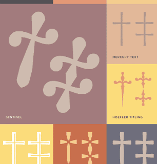
A Beautifully Designed Anicillary Character Gives Me Pause Yes, it’s true, the name of my business, Ampers&® Studio, is centered around, and includes, an ampersand (&) character. Not so surprising. I am, after all, a typographer. And what typographer doesn’t love ampersands? I’ve written about them here.
But in this instance, the letterform giving me pause is that third-order reference mark used in punctuation, a.k.a. the double dagger (‡), pictured here in a graphic I came across on Typography.com. (And isn’t it lovely?) The graphic accompanies an article about Reference Marks:
“Daggers come from that archipelago of typographic symbols known as reference marks, which refer readers elsewhere for explanatory or exegetic notes. The traditional first-order reference mark is the asterisk (*)….”
And that, my friends, makes fascinating reading for typography fanatics such as myself (seriously). If you love type, too, you might enjoy reading more from H&FJ News’ article, House of Flying Reference Marks, or Quillon & Choil, here.*
A Dire Dagger Dillema This glyph, in particular, happened to catch my eye because of a situation in a recent project I’d been working on. You see, an asterisk had already been used within the project’s text, as had the dagger (the second-order reference mark). So when my client requested to add in a third reference set, I used a double dagger, which is standard operating procedure in typography.
Well, as it happens, the dagger had been used to indicate those deceased individuals mentioned within the text (which, if you think about it, is kind of ironic…). Anyway, to use the double dagger as a reference for a distinguished position held, even though proper, somehow didn’t seem right. Further, it was difficult to tell who had been honored and who had passed on! (This would not do at all.) So instead, I threw the rules of typography right out the window (gasp!), and went with a lovely lozenge or diamond (◊), which seems like a much more distinguished mark to use for signifying a distinguished position. So forgive me, my mentors — who taught me the differences between, and proper usage of, EM- EN- and regular ol’ dashes — I know the situation called for a double dagger, but “sometimes you just gotta do whatcha gotta do, eh?”
*Check out the asterisked bit at the end of H&FJ’s article, an advisory notice from the New Oxford English Dictionary on pronunciation. (Don’t you just love it? :)
* * * * * * * * ED. NOTE: This entry was first posted on Blogger, under the handle “ampersandblogger,” in June 2009. : : kf, 1/4/19
::The Emerald Isle Through an Artist’s Eye
INSPIRING WORKS BY INSPIRING ARTISTS, NO. 4
Candace Reed Stella Returns Only recently returned from a trip to Ireland, local artist-teacher Candace Reed Stella [link updated] has been inspired — okay, and perhaps challenged a bit, by yours truly when I asked her if she could handle an impromptu show for our upcoming “NH Wines” tasting/educational event ;) — to create a series of small canvases based on her journey. This will be her second solo show here at Ampers&.
HOW BEAUTIFUL! The brushes must be a-flyin’ over at Candace’s because in the last couple of weeks she has painted and posted photos of several gorgeous pieces on her blog, that are hauntingly beautiful in their simplicity of palette and capture the true spirit of the Irish countryside perfectly. I’ve been fortunate to have visited Ireland a few times, and I found my mind pleasantly drifting back over the western coast of Ireland when I saw her new canvases.
Show Opens June 20 (limited sneak preview on 6/19) In celebration of summer’s arrival, Candace’s exhibit officially opens on Saturday, 6/20/09, from 11-2 PM, with light refreshments offered. This coincides nicely with the grand opening of the Newmarket Farmers’ Market (every Sat, 9-1, in the parking lot of the historic Stone Church Meeting House) and the kick-off of the Music on Main Street series — now in its second season (with live music by local musicians, every Sat. through Labor Day, from 11-2 PM at the bandstand downtown).
A sneak preview of Candace’s works (and hence, my aforementioned “challenge” to Candace) is afforded those guests who sign up to attend a very special NH Wines wine tasting/educational event [link removed], featuring local wine expert Carla Snow, CSW. Click here [link removed] for more info on Carla’s new book: Wine & Dine with New Hampshire, featuring six NH wineries.
The show will run through Thursday, July 2, 2009 in the gallery at Ampers&, with weekday hours from 2-6 PM each T, W, & Th afternoon. Hope to see you there!
* * * * * * * * ED. NOTE: This entry was first posted on Blogger, under the handle “ampersandblogger,” in June 2009. : : kf, 1/4/19
::It’s Hip … It’s Happenin’ … It’s Now!
Detail of large format painting, by Kendra Mongeon
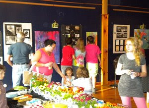
THE 2009 NEWMARKET HIGH SCHOOL SENIOR PORTFOLIO EXHIBITION IS UP AT AMPERS&
I’m always amazed by the distinctive change in moods evoked by whatever art hangs on the soaring navy blue walls in my gallery space…. And for one week only (June 4-11, 2009), I’d have to say the feeling in here is decidedly one of energy and youth.
Detail of photo collage, by Kalie Goodwin
The second annual student portfolio review—sponsored by the Lamprey Arts & Culture Alliance (LACA) — is held each year to honor artistically-inclined members of Newmarket HS’s graduating class. In addition to showcasing their works — including ceramics, photography, paintings, prints, and charcoals — participating students get a chance to win a $100 check from LACA, towards the purchase of art supplies. This year’s lucky winner, selected in a random drawing, was Dana Wergen.
A happy D. Wergen, holding her $100 check, with art instructor A. Blake
Chock full of colorful, creative expressions by twelve budding artists, this show is truly a feast for the eyes and senses. Participating Seniors include: Danielle Dodds, attending Great Bay Community College to study Liberal Arts/Vet Tech; Kaylie Goodwin, attending New England School of Photography to study Portraiture; Jordan Greenfield, attending University of Vermont to study Nursing, with a minor in Art; Jaclyn Jensen, attending Boston College, with an undeclared major; Kendra Mongeon, attending Great Bay Community College to study Liberal Arts; Emily Roulo, attending the New England Institute of Art to study Graphic Design; James Rosa, attending Marine Maritime Academy to study Marine Engineering; Samantha Scott, attending Great Bay Community College to study Vet Tech, with a minor in Art; Michael Sheehan, attending Great Bay Community College to study Art Education; Emily Small, applying to Emerson College to study Film Production; Danarae Wergen, attending Great Bay Community College; and Lindsey Wood, attending Sage College of Albany to study Graphic Design.
Props must go to Ms. Annette Blake — NHS Art Teacher extraordinaire — and her crew of friendly volunteers who came in on Thursday after school and, in a flurry of activity, worked together to install the show in record time. Last night we held a reception for family, friends, and neighbors, and with over 70 people in attendance, the gallery was a bustling hub of happy, smiling visitors — all gathered together for a pleasant evening of community celebration.
Don’t miss out: stop by next week (open T-W-TH afternoons, from 2-6 PM each day) to check out these talented students’ artwork — and be inspired!
At the reception, on June 4th
* * * * * * * * ED. NOTE: This entry was first posted on Blogger, under the handle “ampersandblogger,” in June 2009. : : kf/&, 1/15/21